Redesigning an Administration Tool for a Changing Userbase
- Year: 2018
- Company: ADP
- Platform: Browser
- Role: UX Designer/Researcher
Background
Watson was the project name for the redesign of the StandOut administration tool (StandOut is an employee engagement platform with thousands of clients and hundreds of thousands of users). I was the lead UX designer working on the project. The team consisted of a product manager, three Software Engineers, and myself.
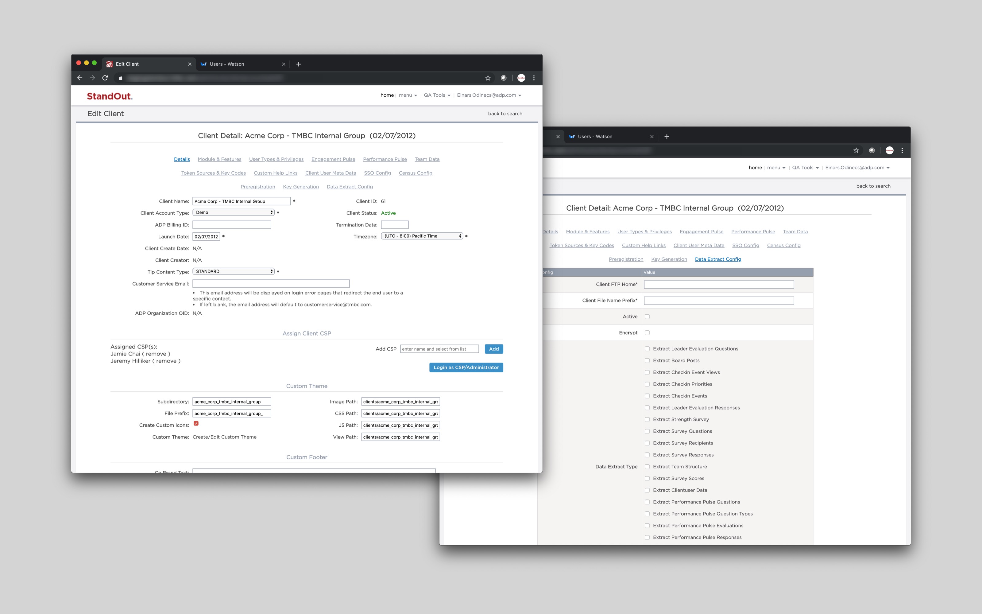
The original application was built by and for a small tech-savvy team, but the primary users were the Customer Success Team, which was rapidly growing, mostly remote, and less technical. The product team was constantly receiving feedback that the existing application was confusing and scary to use.
Research
I worked closely with a Product Manager to do the initial research, which took the form of informal conversation, meetings with leaders from the CS team, and surveys sent to the entire CS Team. We collected their existing pain-points and learned about their daily work, as well as which administrative tasks were the most commonly performed. While there was no analytics implemented into the original application to sift through for patterns, we had direct access to our users — which lead to a refreshingly personal approach to the research.
We learned that users were unsure if they had taken the right action, that their changes were saved, and they worried of unintended consequences from performing some administrative actions. After this, we defined the primary goal for the project: to make administering StandOut less intimidating, easier to understand, and more clear — especially for less technical users.
Process
One of our research findings was that administrative actions were hard to find and not well organized. We started the redesign by coming up with an updated information architecture, which we validated with various stakeholders using spreadsheets as well as low fidelity wireframes. After this I started working on the design.
Since I had a solid MVP that defined the primary administrative tasks users could take as a starting point (activating/deactivating users and clients, configuring client features, changing user permissions, etc.) I was able to think about the application in terms of reusable components, patterns, and conventions that worked for a broad set of user tasks.
We tackled the redesign in sections and subsections. The process was a cycle of working closely with the PM to come up with an initial design, then validating the design with key stakeholders on the CS team, refining the design based off their feedback, refining the design further based of engineering feedback during grooming sessions, working with engineering on implementation, and then more validation with the whole CS team once the section was available to use. We repeated this process as we tackled the various sections.
Design Highlights
Since the project had a lot of sections and features, I will only highlight a few conventions we used that made the most significant impact in making Watson less intimidating and easier to use.
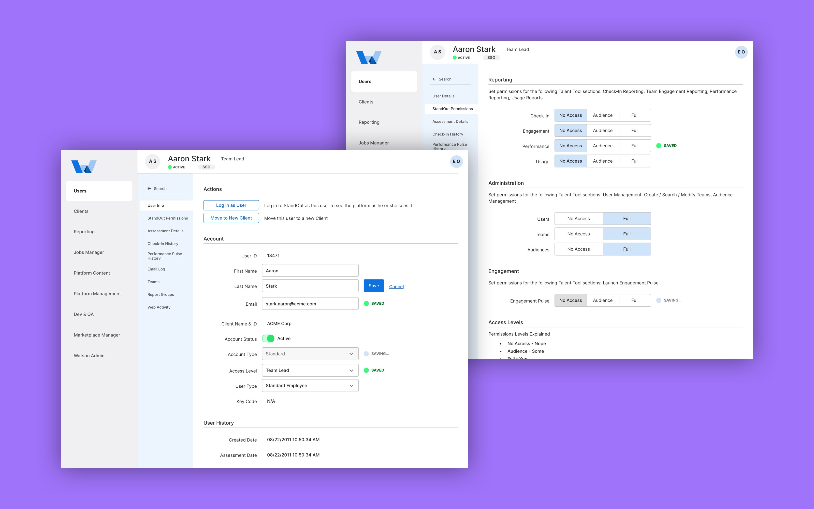
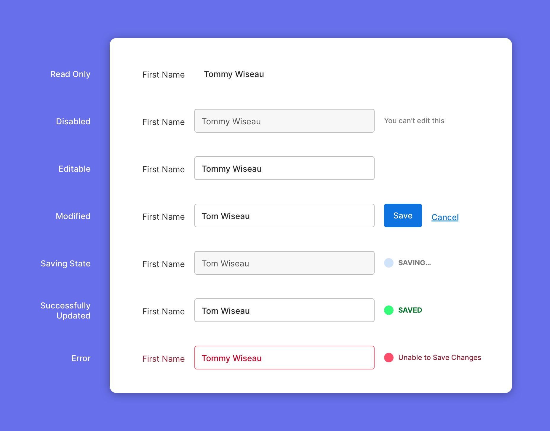
Inputs
A lot of time, administrative tasks only involved updating a few inputs. I designed the input component to handle all the states required for saving, validation, and displaying errors. This reduced cognitive load by providing the user with explicit feedback on what fields were updated and giving them immediate and relevant feedback on validation errors and other issues.
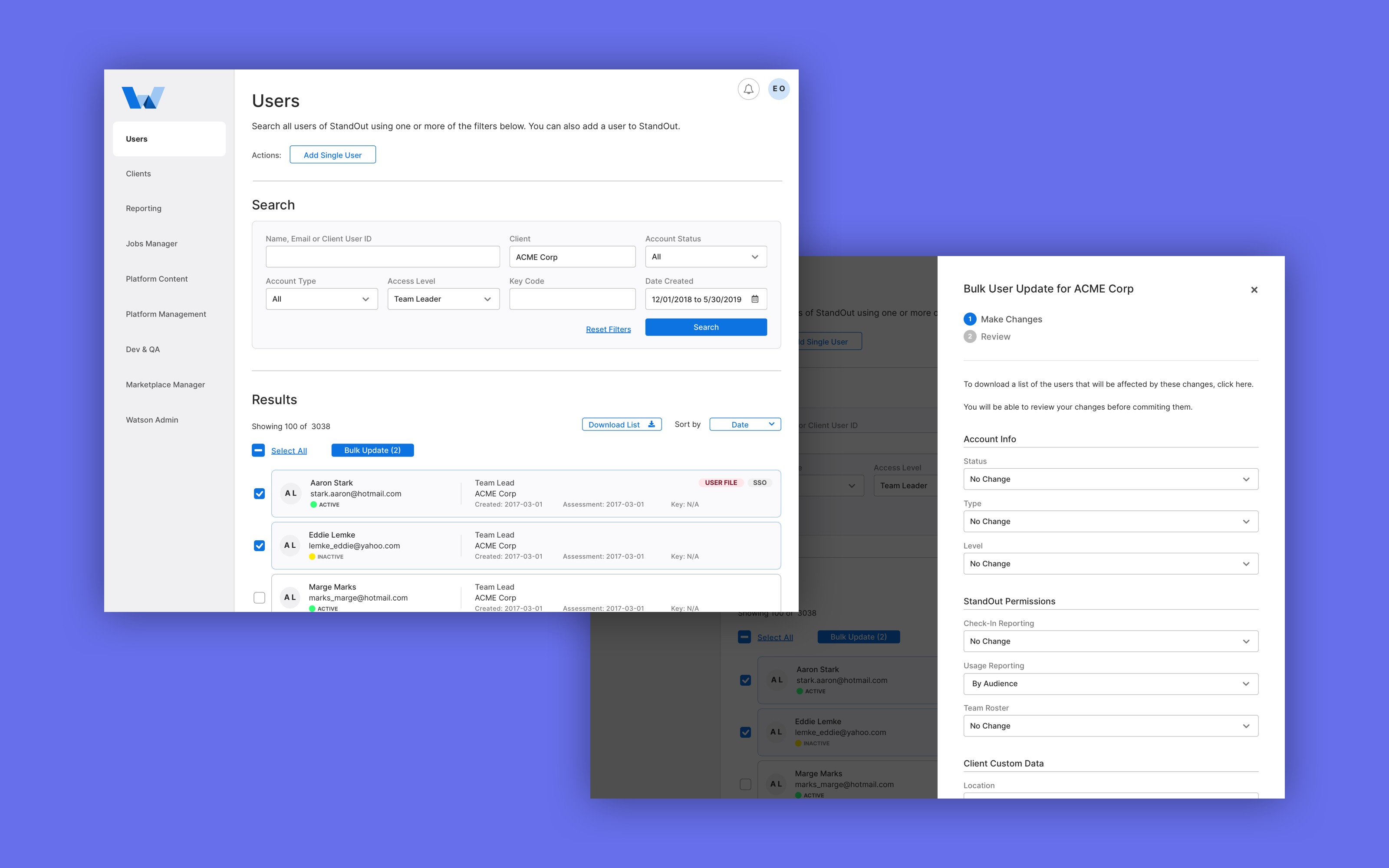
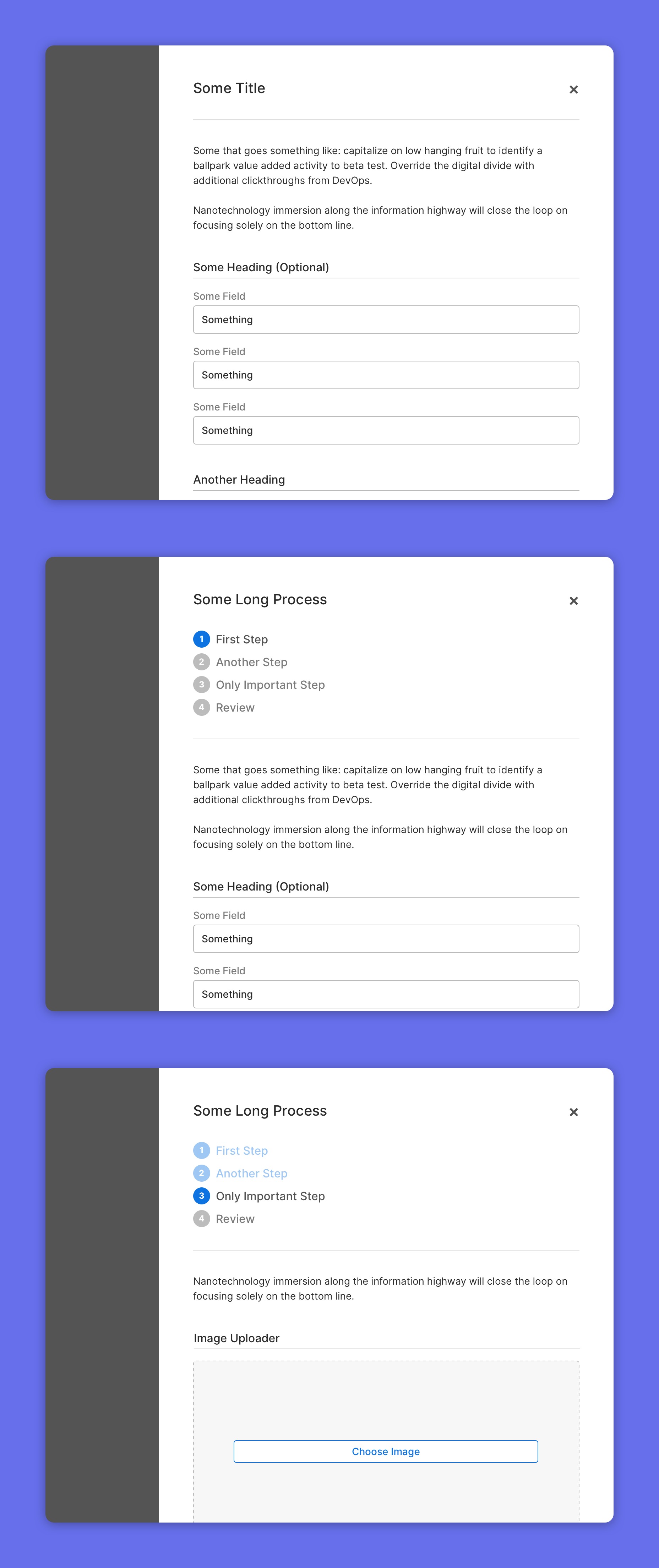
Side-modal Convention
More complicated tasks that involved updating several inputs were reserved for side-modals. This pattern scaled well to the various sections and was predictable for the user. Longer or branching tasks were broken up into multiple steps, with a review step at the end to allow the user to confirm the changes they were about to make. This made performing more complex administrative tasks feel more explicit.
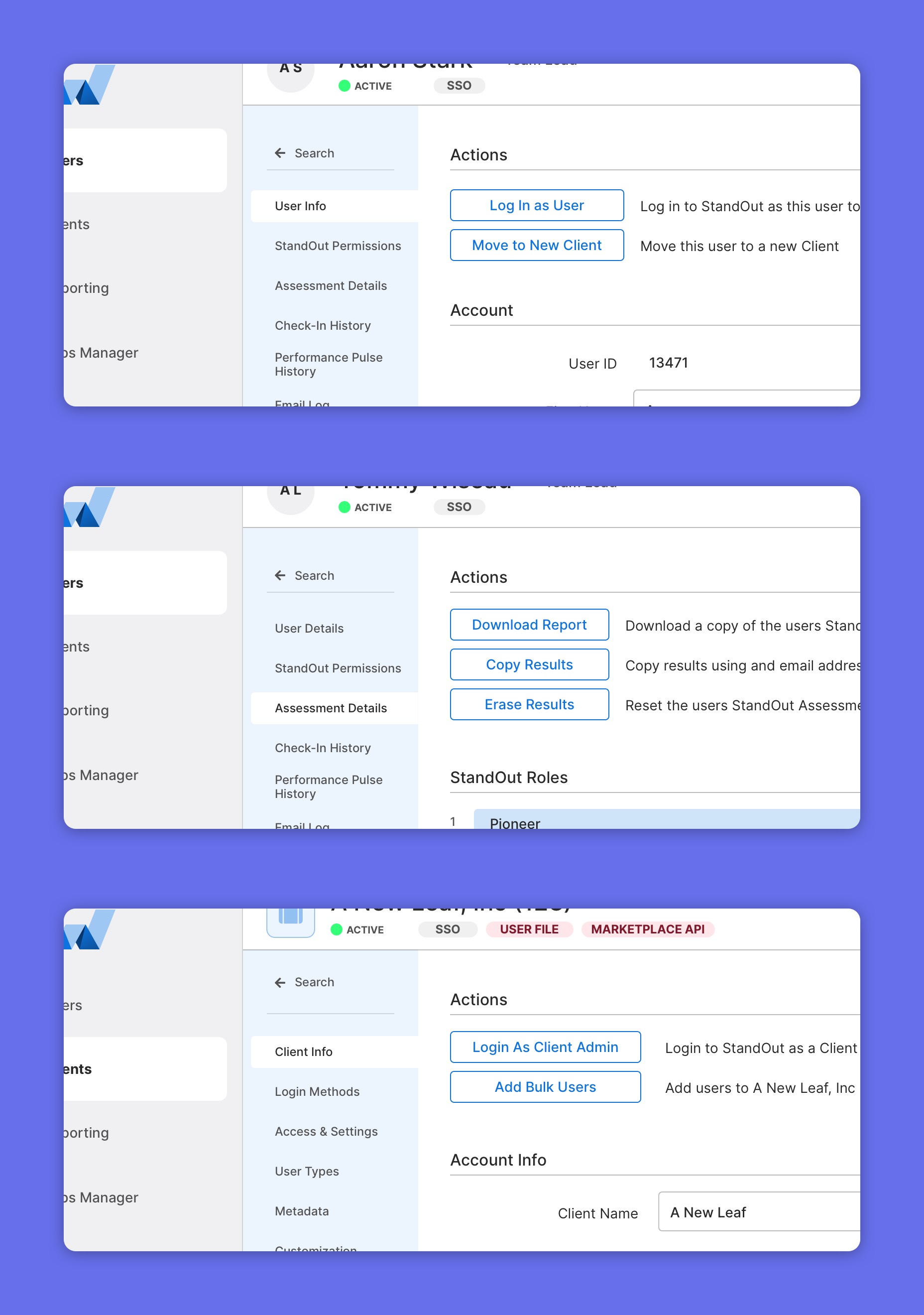
Actions on Top
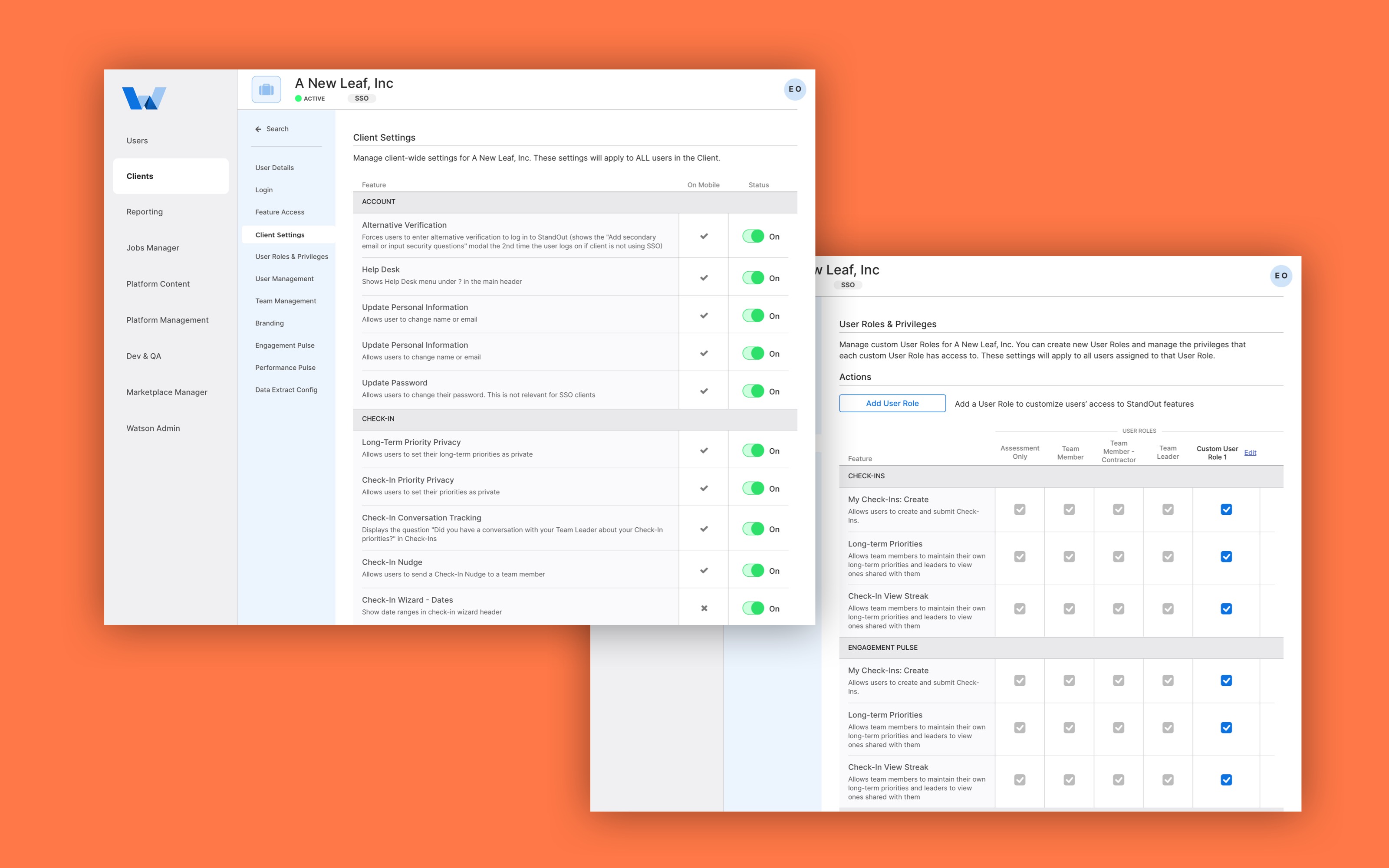
Actions on top of sections revealing the most essential tasks that can be performed there with clear explanations. This pattern made the application feel familiar and consistent across the sections.
Takeaways
We only had qualitative goals for the redesign, and in this sense, the project was a success because of the continuous positive feedback from the CS Team. As work progressed, the main challenge we faced was how to build reusable components to accelerate the development process. While I took extra care to make sure I designed using repeatable patterns and used a Sketch Symbol Library to make sure my designs were consistent across sections, this did not translate to the code.